 HexaPDF
The Composer
In this tutorial you will get to know the HexaPDF::Composer class which is the high-level class for creating PDF documents. You might want to open the resulting PDF to more easily understand and see the results.
Creating a Composer
The composer class makes it easy to create nice-looking PDF documents. It does this by providing a high-level interface for creating and styling content.
First you need to create a composer instance:
require 'hexapdf'

composer = HexaPDF::Composer.new
There is also a block-form using HexaPDF::Composer::create which comes in handy if the document is not that complex.
Behind the scenes the composer creates a HexaPDF::Document instance and the first page. Both can be accessed via the respective instance methods #document and #page.
We use the document instance to define a TrueType font:
composer.document.config['font.map'] = {
  'Lato' => {
    none: '/usr/share/fonts/truetype/lato/Lato-Regular.ttf',
    bold: '/usr/share/fonts/truetype/lato/Lato-Bold.ttf',
    italic: '/usr/share/fonts/truetype/lato/Lato-Italic.ttf',
    bold_italic: '/usr/share/fonts/truetype/lato/Lato-BoldItalic.ttf',
  }
}
Everytime a page is created by the composer, an accompanying HexaPDF::Layout::Frame instance is also created. This frame defines the space used for laying out the content. We will come back to that later.
Adding Content
Content for the composer is defined via boxes. A box defines its content (e.g. text, image, other boxes, …), how that content is styled and how it should be layed out. See Document Layout for details.
Let’s output some basic text:
composer.text('Composer Tutorial', font: 'Lato bold',
              font_size: 24, text_align: :center)
This will show ‘Composer Tutorial’ at the top of the page since boxes are laid out from top to bottom.
We can enable the debug mode to see the extent of a layed out box:
composer.document.config['debug'] = true
composer.text("Let's enable debug mode to see the box extent", font: 'Lato')
composer.document.config['debug'] = false
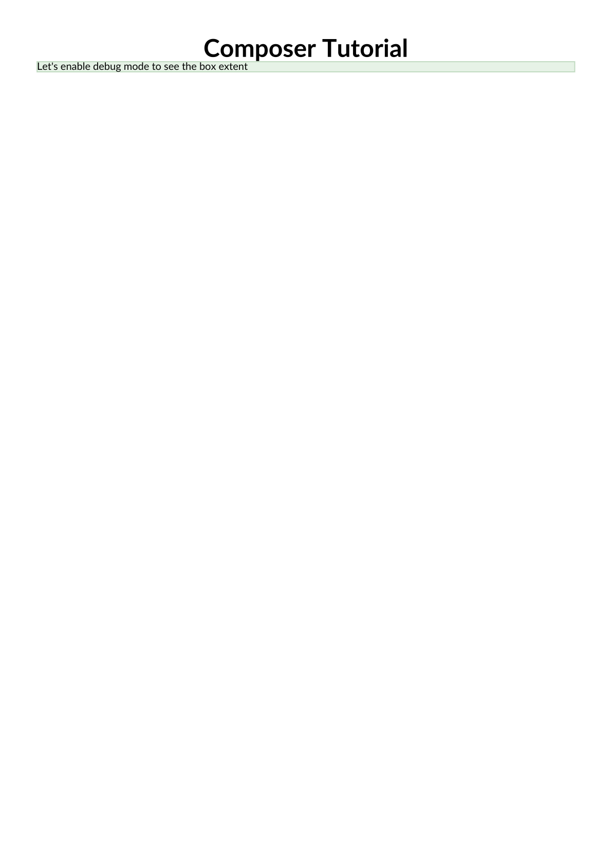
This text box is shown in light green and we see that it takes the full width of the frame. It doesn’t cover the full width of the page since by default there is a margin around the frame.
Enabling debug mode is useful for debugging layout problems. Each box will add a layer to the PDF for toggling the visibility state of its debug highlighting rectangle.
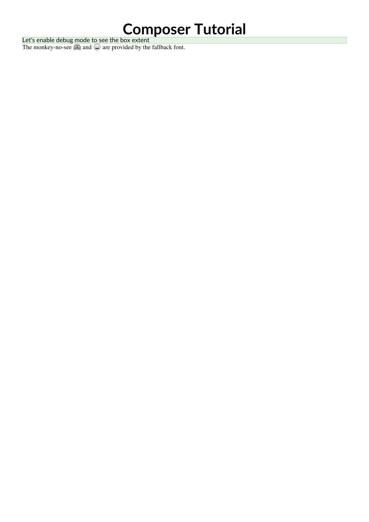
Sometimes the selected font doesn’t contain all glyphs that one wants to display. This often happens with emoji but can happen for any character. HexaPDF provides the ability to use fallback fonts in such cases:
composer.document.config['font.map'] = {
  'Emoji' => {none: File.expand_path('~/.fonts/NotoEmoji-Regular.ttf'),
              bold: File.expand_path('~/.fonts/NotoEmoji-Bold.ttf')}
}
composer.document.config['font.fallback'] << 'Emoji'
composer.text("The monkey-no-see 🙈 and 😄 are provided by the fallback font.")
Besides simple text HexaPDF also has built-in support for formatted text, images, column boxes and lists. Let’s put a list into a column box:
composer.column(columns: 2, gaps: 30, equal_height: true) do |column|
  column.list(marker_type: :square, item_spacing: 16) do |list|
    list.multiple do |item_1|
      item_1.formatted_text(["This is ", {text: "formatted", fill_color: "red"},
                             " text. And one of two boxes of this item."], font: 'Lato')
      item_1.lorem_ipsum
    end
    3.times { list.lorem_ipsum }
  end
end
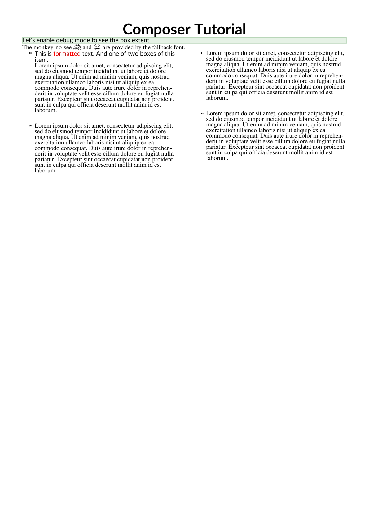
The #formatted_text method uses an array of strings and hashes
to define its content. The simplest form of such a hash is {text: 'Some test',
**style_properties}. This allows one to format parts of a paragraph differently and to insert
inline boxes (think emojis, inline graphs, …).
The child boxes of the column and list boxes are defined in the blocks, with the block argument
fulfilling a role similar to the composer instance. The special method #multiple allows adding
multiple content boxes at once which is useful for defining list items with more than one content
box (like with the first list item above).
Styling Content
Each box has an associated style, an instance of HexaPDF::Layout::Style. We have already seen some
style properties, like font, being set on a box.
Style properties can either be set when invoking a box drawing method, like we have already seen, or
predefined via #style. By predefining styles it is possible to re-use
them and have a consistent visual appearance.
Let’s define two styles, one for headers and one for paragraphs:
header_marker = lambda do |canvas, box|
  canvas.line_width(10).stroke_color("6a6").line(-8, 0, -8, box.height).stroke
end
composer.style(:header, font: 'Lato bold', font_size: 16,
               margin: [20, 0, 16], padding: [10, 0, 8], overlays: [header_marker])
composer.style(:paragraph, font: 'Lato', font_size: 12, margin: [0, 0, 12],
               text_align: :justify)
Both styles define the font and font
size as well as a margin and
some other style properties. For example, the header will have a green bar to its left curtesy of
the header_marker overlay.
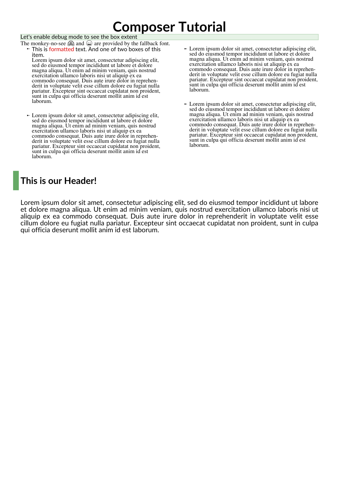
Now we just need to use those styles and so we put a text box formatted as header and another text box formatted as paragraph onto the page:
composer.text('This is our Header!', style: :header)
composer.lorem_ipsum(style: :paragraph)
Placement of Content
Content boxes are usually placed top to bottom, one below the other. However, it is possible to instruct the layout engine to use different placements using the #position, #align, #valign and #mask_mode style properties.
The frame that gets created when adding a page defines the space where boxes may be placed. Usually, the frame has a rectangular shape but it may actually be a set of arbitrary, axis-aligned, rectilinear polygons.
Let’s “float” a box to the side and then draw the outline of the frame in red:
# Let's create a Form XObject acting as the image
image = composer.create_stamp(100, 100) do |canvas|
  canvas.opacity(fill_alpha: 0.5).fill_color("6a6").
    rectangle(5, 5, 90, 90, radius: 10).fill
end

composer.image(image, width: 100, position: :float, margin: [0, 10, 10, 0])
composer.canvas.
  save_graphics_state.stroke_color("red").
  draw(:geom2d, object: composer.frame.shape).
  restore_graphics_state
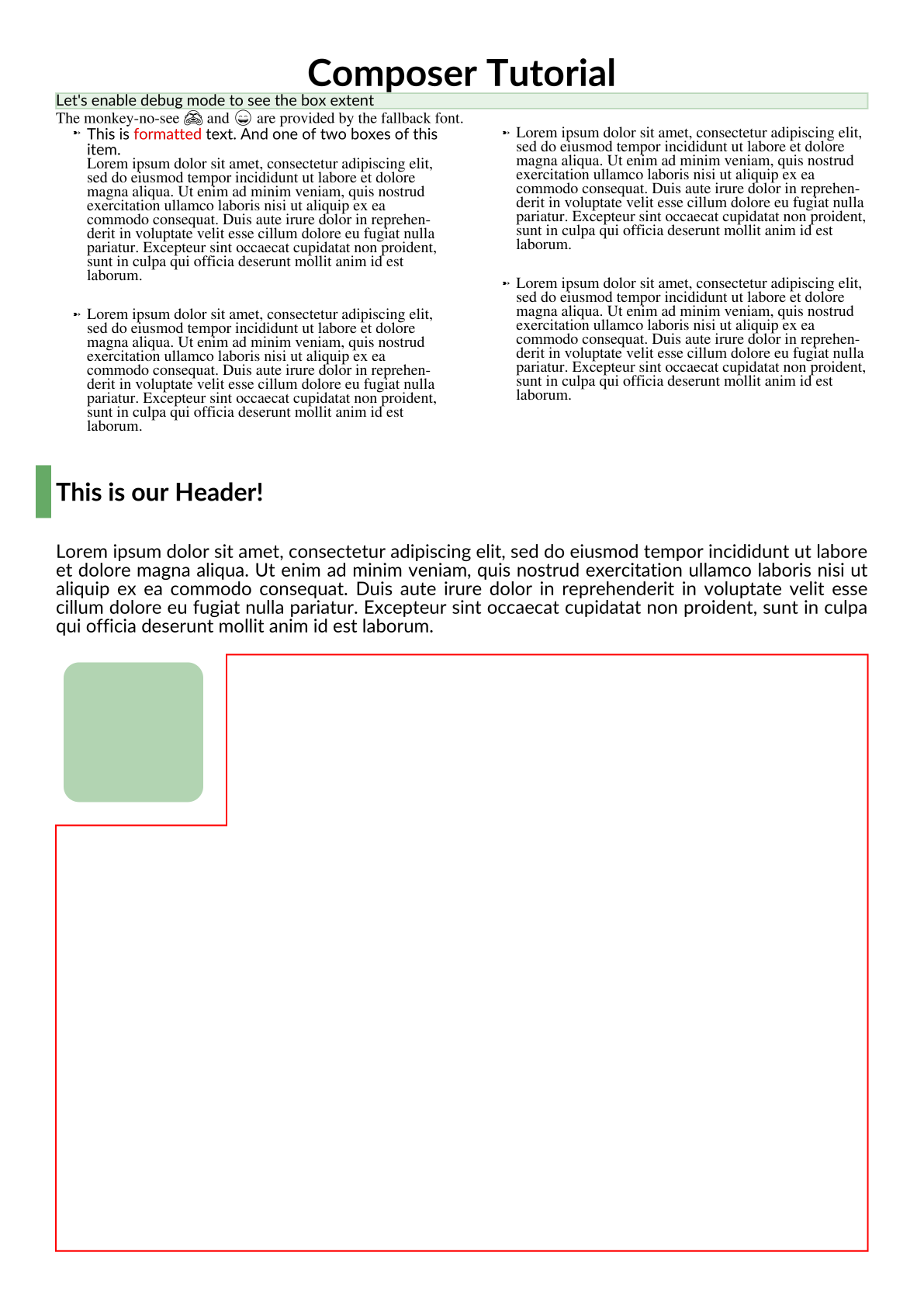
You can see that the frame is not rectangular anymore! The space occupied by the floating image has been removed from it.
The default placement uses a rectangular region starting from the top-most, left-most point of the frame’s shape. So if we draw some text, it will be put right next to the floating image:
composer.lorem_ipsum(count: 2, style: :paragraph)
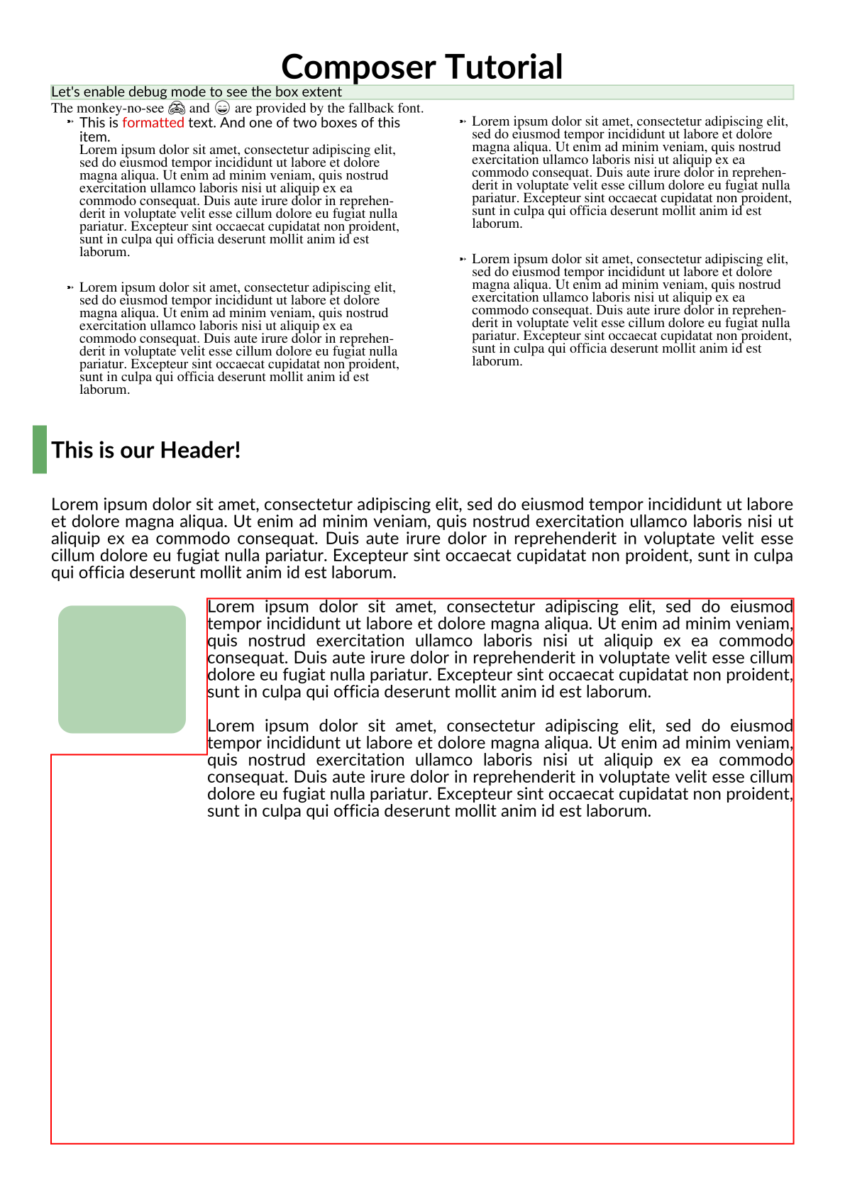
Putting the text to the right works but the text does not go beneath the image, i.e. it doesn’t flow around it. The reason for this is that by default the box is fit into to above mentioned rectangular region.
If we need to flow the text around the image, we need to instruct the layout engine and box implementations to use the shape of the frame. Let’s draw the image again and now flow the text around it:
composer.image(image, width: 100, position: :float, margin: [0, 10, 0, 0])
composer.lorem_ipsum(count: 2, style: :paragraph, position: :flow)
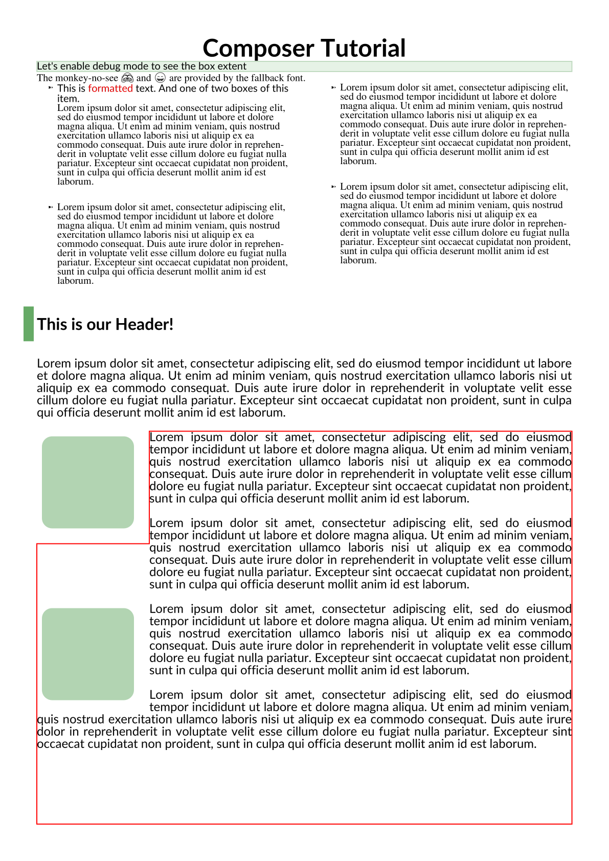
Note the added position: :flow argument which makes the difference. You would generally also use
that argument with container boxes if you use it for text boxes.
Page Styles
By default new pages will be empty and the frame will have a margin but nothing else. This can be overridden with page styles.
A page style defines at least the size and orientation of a page as well as the frame that should be used. Additionally, it can optionally set the initial content (think background, logo, fixed footer, …) as well as the name of the page style for the next page.
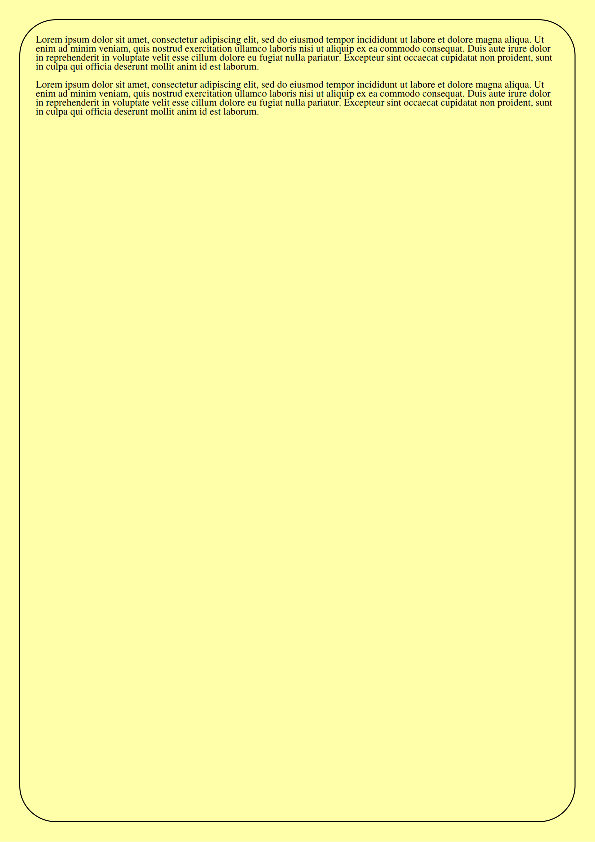
Let’s define a simple page style and then create a new page with it:
composer.page_style(:simple, page_size: :A4) do |canvas, style|
  page_box = canvas.context.box
  canvas.fill_color("ffa") do
    canvas.rectangle(0, 0, page_box.width, page_box.height).
      fill
  end
  canvas.rectangle(20, 20, page_box.width - 40, page_box.height - 40, radius: 36).stroke
  style.frame = style.create_frame(canvas.context, 36)
end

composer.new_page(:simple)
composer.lorem_ipsum(count: 2)
All new pages will now use that page style. By setting the #next_style attribute of the page
style, it is possible to automatically switch between styles (e.g. between a left page style and a
right page style).
Note that if you want to use a custom style for the first page of a document, you need to use the
skip_page_creation: true argument when creating a composer instance.
As last step we need to write the created PDF document
composer.write("composer-tutorial.pdf")
which concludes this tutorial!
The Complete Code and Result PDF
Here is the complete code generating this result PDF:
require 'hexapdf'

composer = HexaPDF::Composer.new

composer.document.config['font.map'] = {
  'Lato' => {
    none: '/usr/share/fonts/truetype/lato/Lato-Regular.ttf',
    bold: '/usr/share/fonts/truetype/lato/Lato-Bold.ttf',
    italic: '/usr/share/fonts/truetype/lato/Lato-Italic.ttf',
    bold_italic: '/usr/share/fonts/truetype/lato/Lato-BoldItalic.ttf',
  }
}

composer.text('Composer Tutorial', font: 'Lato bold',
              font_size: 24, text_align: :center)

composer.document.config['debug'] = true
composer.text("Let's enable debug mode to see the box extent", font: 'Lato')
composer.document.config['debug'] = false

composer.document.config['font.map'] = {
  'Emoji' => {none: File.expand_path('~/.fonts/NotoEmoji-Regular.ttf'),
              bold: File.expand_path('~/.fonts/NotoEmoji-Bold.ttf')}
}
composer.document.config['font.fallback'] << 'Emoji'
composer.text("The monkey-no-see 🙈 and 😄 are provided by the fallback font.")

composer.column(columns: 2, gaps: 30, equal_height: true) do |column|
  column.list(marker_type: :square, item_spacing: 16) do |list|
    list.multiple do |item_1|
      item_1.formatted_text(["This is ", {text: "formatted", fill_color: "red"},
                             " text. And one of two boxes of this item."], font: 'Lato')
      item_1.lorem_ipsum
    end
    3.times { list.lorem_ipsum }
  end
end

header_marker = lambda do |canvas, box|
  canvas.line_width(10).stroke_color("6a6").line(-8, 0, -8, box.height).stroke
end
composer.style(:header, font: 'Lato bold', font_size: 16,
               margin: [20, 0, 16], padding: [10, 0, 8], overlays: [header_marker])
composer.style(:paragraph, font: 'Lato', font_size: 12, margin: [0, 0, 12],
               text_align: :justify)

composer.text('This is our Header!', style: :header)
composer.lorem_ipsum(style: :paragraph)

# Let's create a Form XObject acting as the image
image = composer.create_stamp(100, 100) do |canvas|
  canvas.opacity(fill_alpha: 0.5).fill_color("6a6").
    rectangle(5, 5, 90, 90, radius: 10).fill
end

composer.image(image, width: 100, position: :float, margin: [0, 10, 10, 0])
composer.canvas.
  save_graphics_state.stroke_color("red").
  draw(:geom2d, object: composer.frame.shape).
  restore_graphics_state

composer.lorem_ipsum(count: 2, style: :paragraph)

composer.image(image, width: 100, position: :float, margin: [0, 10, 0, 0])
composer.lorem_ipsum(count: 2, style: :paragraph, position: :flow)

composer.page_style(:simple, page_size: :A4) do |canvas, style|
  page_box = canvas.context.box
  canvas.fill_color("ffa") do
    canvas.rectangle(0, 0, page_box.width, page_box.height).
      fill
  end
  canvas.rectangle(20, 20, page_box.width - 40, page_box.height - 40, radius: 36).stroke
  style.frame = style.create_frame(canvas.context, 36)
end

composer.new_page(:simple)
composer.lorem_ipsum(count: 2)

composer.write("composer-tutorial.pdf")