Simple Text Metrics Published on
The first simple step for HexaPDF to gain advanced text functionality is to use the available font and glyph metrics to correctly determine the width and height of a piece of text. Note that I will only talk about text laid out horizontally, not vertically.
Each font provides for each glyph its advance width (i.e. the distance between the current origin of the text coordinate system and the origin for the next glyph; note that when positioning glyphs the text coordinate system is transformed so that its origin coincides with the origin of the glyph coordinate system) and its bounding box (i.e. the tightest box around the visible glyph outlines).
All these metrics are defined for a glyph of unit proportions. To make a text larger or smaller the font size is used.
In addition the PDF specification provides four text modification operators that influence the width and height of text:
- character spacing (additional spacing between characters)
- word spacing (like character spacing but only for ASCII spaces, i.e. this additional spacing is applied only to glyphs that have a single byte encoding equal to ASCII space)
- horizontal scaling (a stretch factor applied to all horizontal measurements, so not only to glyphs but also to character spacing, for example.
- text rise (the vertical offset from the baseline)
Finally, kerning values (which work similar to character spacing but only for adjacent glyphs) can change the width of text.
With this information it is possible to determine the width and height of a piece of text. Once this information is available, it is possible to use box and text layouting algorithms to create lines of text laid out in a rectangular area.
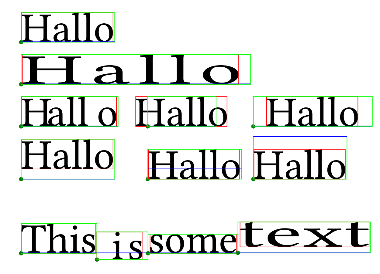
Here is an image of what can currently be done (see the gist for details):

- The green boxes show the text boxes themselves. The red boxes are the tightest boxes around all glyphs of each text. And the blue lines show the baselines of the texts.
- The first row is just text, with no additional modifications or kerning.
- The second row shows the application of some text modification operators.
- The third row shows text with kerning values within the text and at the boundaries. This also shows that the text can spill over the text box boundaries.
- The fourth row shows the result of applying various positive and negative text rise values, as indicated by the different positions of the baseline.
- Finally, the last row shows how these text metrics can be used to correctly position text fragments along a continuous baseline.
Next step: Use the functionality of the now implemented text fragments to implement line fragment objects, and implement a basic text shaping class.
 HexaPDF