class HexaPDF::
| Parent | HexaPDF::Layout::Box |
|---|
A TableBox allows placing boxes in a table.
A table box instance can be fit into a rectangular area. The widths of the columns is determined by the column_widths definition. This means that there is no auto-sizing supported.
If some rows don’t fit into the provided area, the table is split. The style of the original table is also applied to the split box.
Table Cell¶ ↑
Each table cell is a Box instance and can have an associated style, e.g. for creating borders around the cell contents. It is also possible to create cells that span more than one row or column. By default a cell has a solid, black, 1pt border and a padding of 5pt on all sides.
It is important to note that the drawing of cell borders (just the drawing, size calculations are done as usual) are handled differently from standard box borders. While standard box borders are drawn inside the box, cell borders are drawn on the bounds of the box. This means that, visually, the borders of adjoining cells overlap, with the borders of cells to the right and bottom being on top.
To make sure that the cell borders are not outside of the table’s bounds, the left and top border widths of the top-left cell and the right and bottom border widths of the bottom-right cell are taken into account when calculating the available space.
Examples¶ ↑
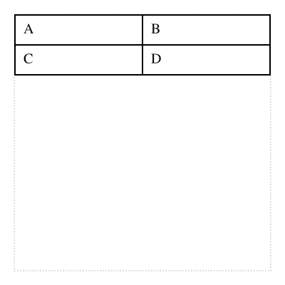
Let’s start with a basic table:
cells = [[layout.text('A'), layout.text('B')],
         [layout.text('C'), layout.text('D')]]
composer.table(cells)
The HexaPDF::Document::Layout#table_box method accepts the cells as positional argument instead of as keyword argument but all other arguments of ::new work the same.
While the table box itself only allows box instances as cell contents, the layout helper method also allows text which it transforms to text boxes. So this is the same as the above:
composer.table([['A', 'B'], ['C', 'D']])Each cell can hold zero or more boxes:
cells = [[[layout.text('A'), layout.image(machu_picchu, height: 40)], layout.text('B')],
         [nil, layout.text('D')]]
composer.table(cells)
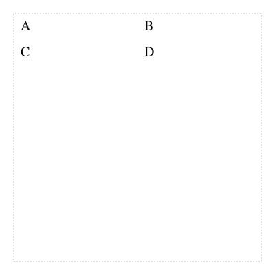
The style of the cells can be customized, e.g. to avoid drawing borders:
cells = [[layout.text('A'), layout.text('B')],
         [layout.text('C'), layout.text('D')]]
composer.table(cells, cell_style: {border: {width: 0}})
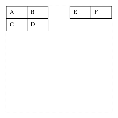
If the table doesn’t fit completely, it is automatically split (in this case, the last row gets moved to the second column):
cells = [[layout.text('A'), layout.text('B')],
         [layout.text('C'), layout.text('D')],
         [layout.text('E'), layout.text('F')]]
composer.column(height: 50) {|col| col.table(cells) }
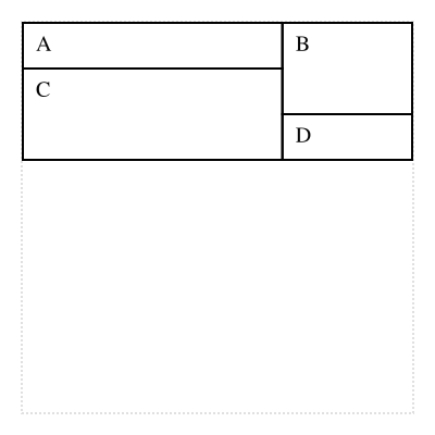
It is also possible to use row and column spans:
cells = [[{content: layout.text('A'), col_span: 2}, {content: layout.text("B\nB\nB"), row_span: 2}],
         [{content: layout.text('C'), col_span: 2, row_span: 2}],
         [layout.text('D')]]
composer.table(cells)
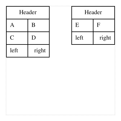
Each table can have header rows and footer rows which are shown for all split parts:
header = lambda {|tb| [[{content: layout.text('Header', text_align: :center), col_span: 2}]] }
footer = lambda {|tb| [[layout.text('left'), layout.text('right', text_align: :right)]] }
cells = [[layout.text('A'), layout.text('B')],
         [layout.text('C'), layout.text('D')],
         [layout.text('E'), layout.text('F')]]
composer.column(height: 90) {|col| col.table(cells, header: header, footer: footer) }
While the width of a cell is determined by the column_widths array, the height is automatically determined during fitting of the content. However, it is also possible to use a fixed height (only if the actual content is smaller or equal than it):
cells = [[{content: layout.text('A'), min_height: 5}, layout.text('B')],
         [{content: layout.text('C'), min_height: 40}, layout.text('D')]]
composer.table(cells)
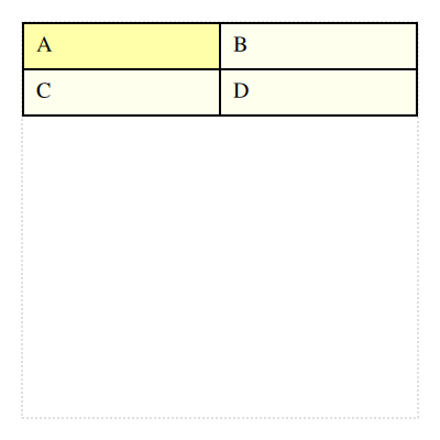
The cells can be styled using a callable object for more complex styling:
cells = [[layout.text('A'), layout.text('B')],
         [layout.text('C'), layout.text('D')]]
block = lambda do |cell|
  cell.style.background_color =
    (cell.row == 0 && cell.column == 0 ? 'ffffaa' : 'ffffee')
end
composer.table(cells, cell_style: block)
Attributes
The Cells instance containing the data of the table.
If this is an instance that was split from another one, the cells contain all the rows, not just the ones for this split instance.
Also see start_row_index.
This value is -1 if fit was not yet called. Otherwise it contains the row index of the last row that could be fitted.
Public Class Methods
Creates a new TableBox instance.
cells-
This needs to be an array of arrays containing the data of the table. See
Cellsfor more information on the allowed contents.Alternatively, a
Cellsinstance can be used. Note that in this case thecell_styleargument is not used. column_widths-
An array defining the width of the columns of the table. If not set, defaults to an empty array.
Each entry in the array may either be a positive or negative number. A positive number sets a fixed width for the respective column.
A negative number specifies that the respective column is auto-sized. Such columns split the remaining width (after substracting the widths of the fixed columns) proportionally among them. For example, if the column width definition is [-1, -2, -2], the first column is a fifth of the width and the other two columns are each two fifth of the width.
If the
cellsdefinition has more columns than specified bycolumn_widths, the missing entries are assumed to be -1. header-
A callable object that needs to accept this
TableBoxinstance as argument and that returns an array of arrays containing the header rows.The header rows are shown for the table instance and all split boxes.
footer-
A callable object that needs to accept this
TableBoxinstance as argument and that returns an array of arrays containing the footer rows.The footer rows are shown for the table instance and all split boxes.
cell_style-
Contains styling information that should be applied to all header, body and footer cells.
This can either be a hash containing style properties or a callable object accepting a cell as argument.
HexaPDF::Layout::Box::new
Public Instance Methods
Returns true if not a single row could be fit.
HexaPDF::Layout::Box#empty?
 HexaPDF
